Easy Drink
Easy Drink
Complete revamp of an app connectig consumers with affordable drinking, while limiting waste.
My Role
As the sole designer on this project, I took charge of every aspect of the redesign process. From ideation to execution, I led the charge in crafting an intuitive and engaging app experience 🙂
My responsibilities included:
- Conducting extensive research to understand the needs of both end users and store owners.
- Creating user personas to guide the design strategy, making sure it resonated with our target audience.
- Developing user flows and information architecture to streamline the app’s navigation.
- Collaborating closely with stakeholders and incorporating feedback to refine the design iteratively.
- Designing 60+ high fidelity screens!
Area
Product Design
UX/UI
Brand Identity
Tools
Adobe XD
Illustrator
Lottie Lab
Miro
Paper & Pen 🙂
Team
1 Designer (Me)
2 Developers
Company
Easy Drink (Freelance)
Time
2 Months
2023
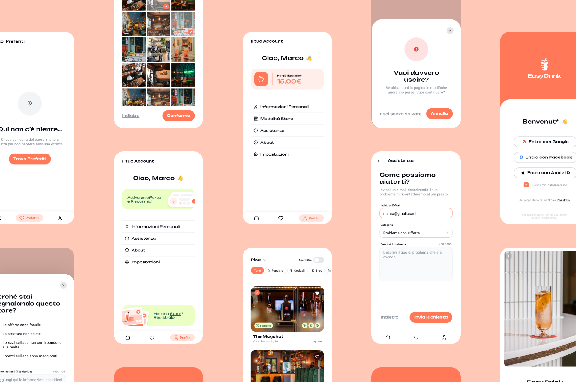
Visual Language
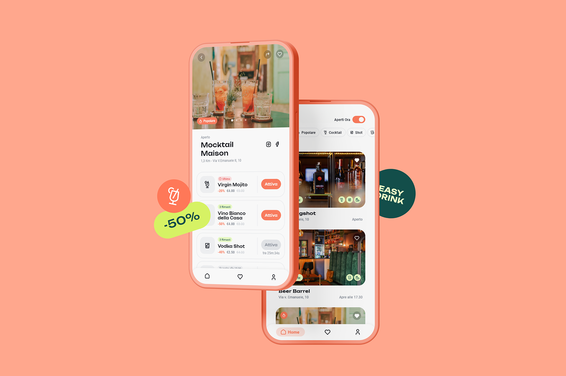
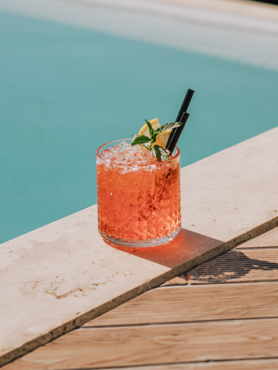
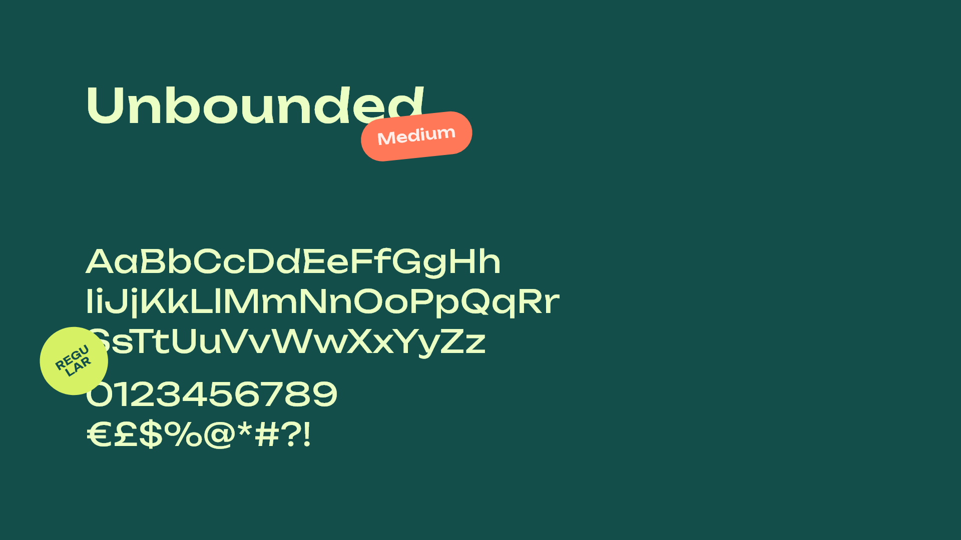
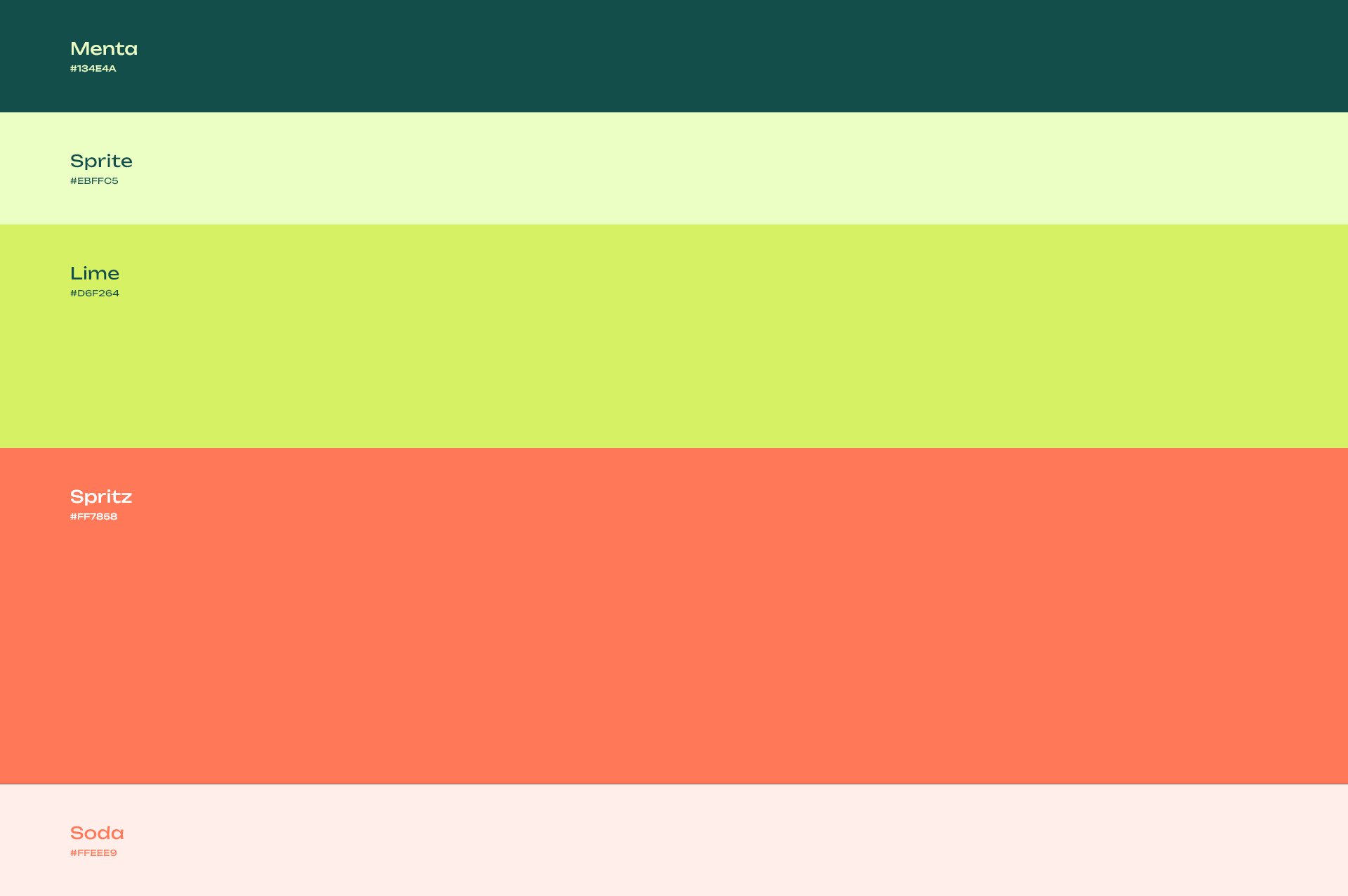
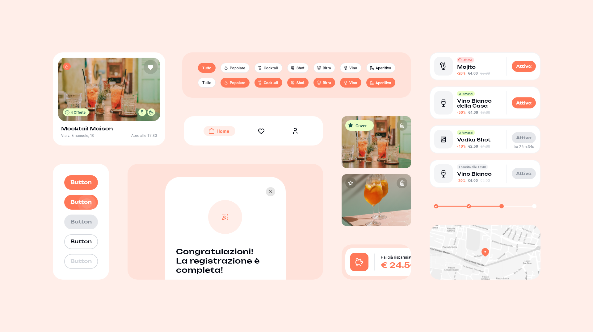
Friedly rounded corners, a quirky font and a polished UI with pops of bright colors inspired by Italy’s beloved Spritz 🍹.
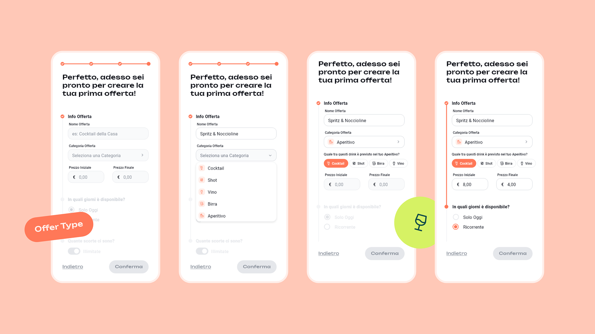
The heart of the app: Offer Activation Flow


🡥 Hi-Fi Prototipes, created on Adobe XD.
Splash-Screen Animation created with Lottie.
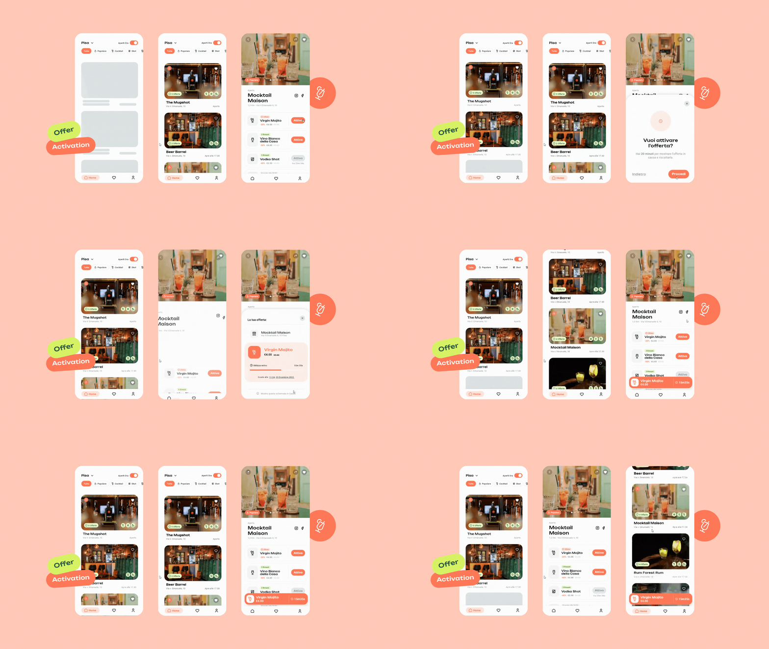
Making up for lack of testing with Secodnary Research.
So much tought went into these 3 little screens.
While I didn’t have the opportunity to conduct A/B testing with users, I compensated with extensive secondary and desk research.
Every little decision was backed by data and insights, making sure that what I lacked in direct feedback, I made up for in thorough understanding and strategic foresight.
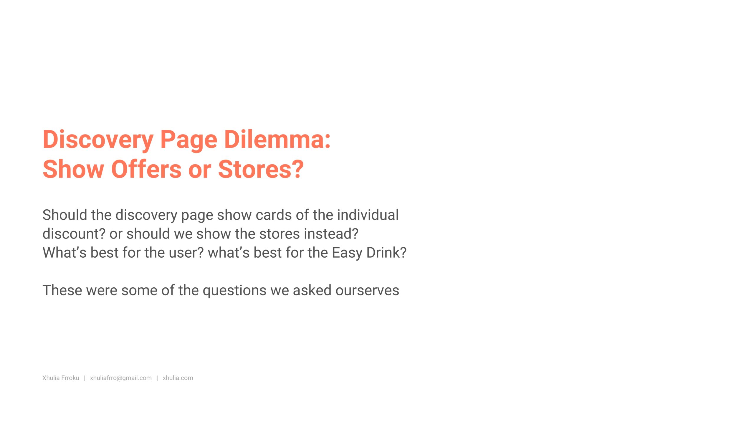
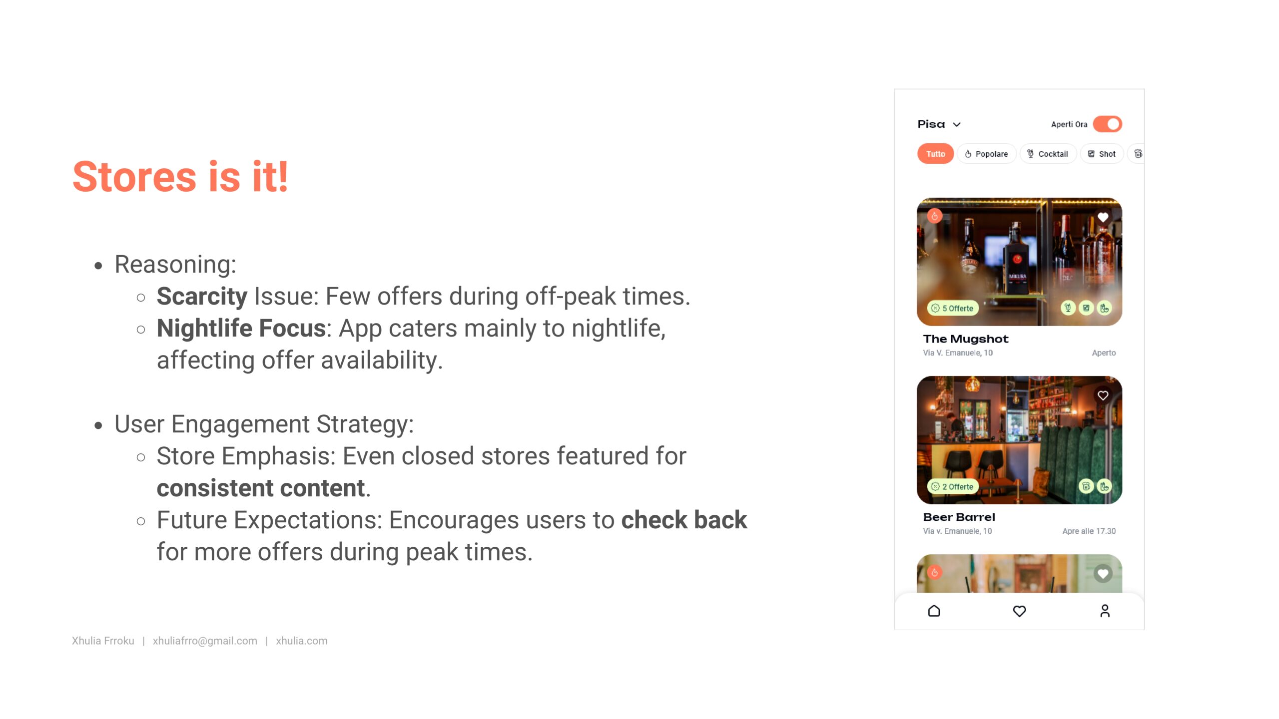
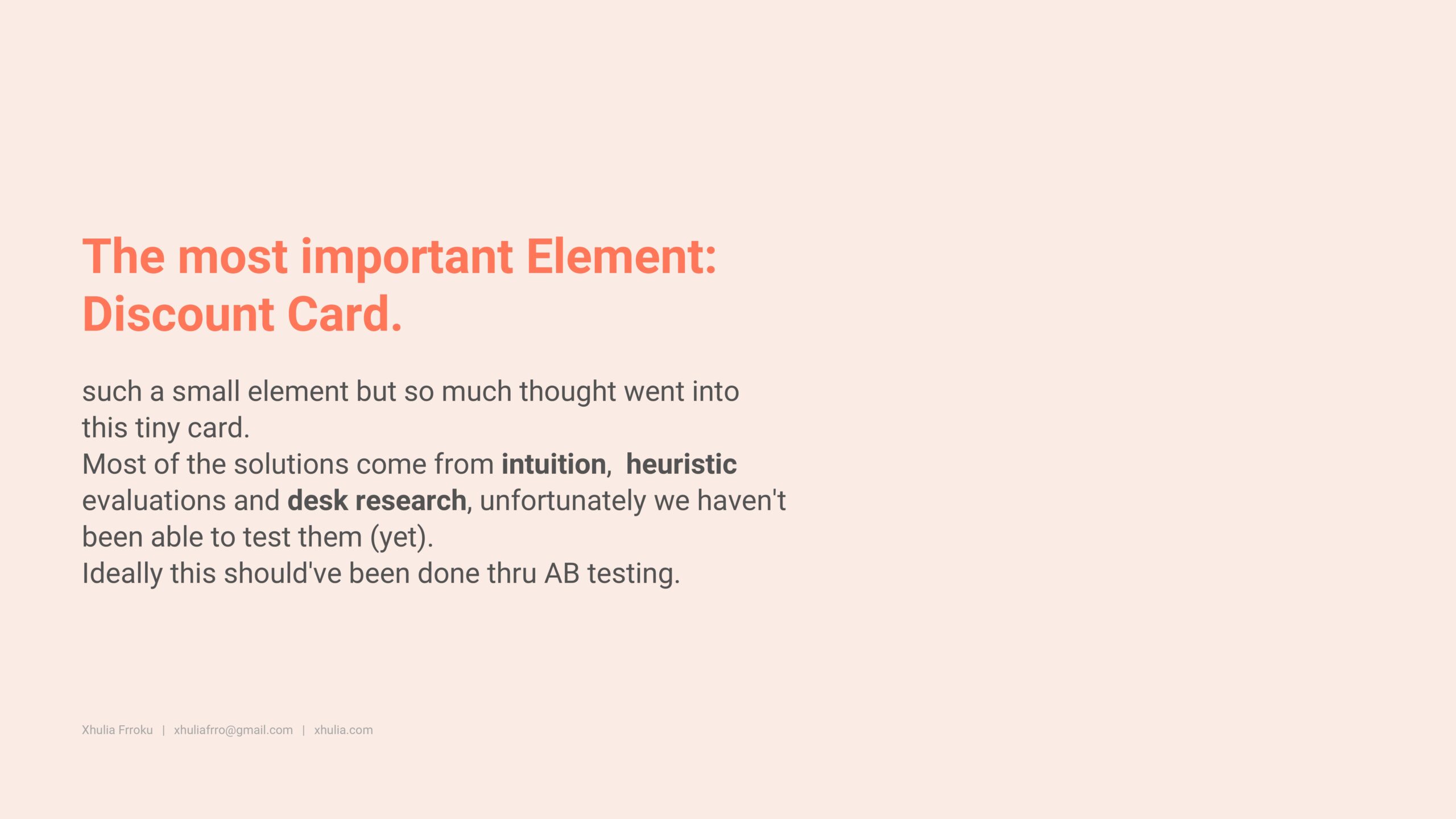
Sneak peek into the UX Process 👀
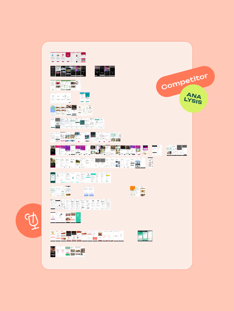
I conducted extensive benchmarking and indirect competitor analysis, drawing inspiration from similar industries and stole the best bits.
I looked at Delivery and Food-Saving Apps for the general layout and Common patterns.
I looked at AirBnb for their host On-Boarding and TOV.
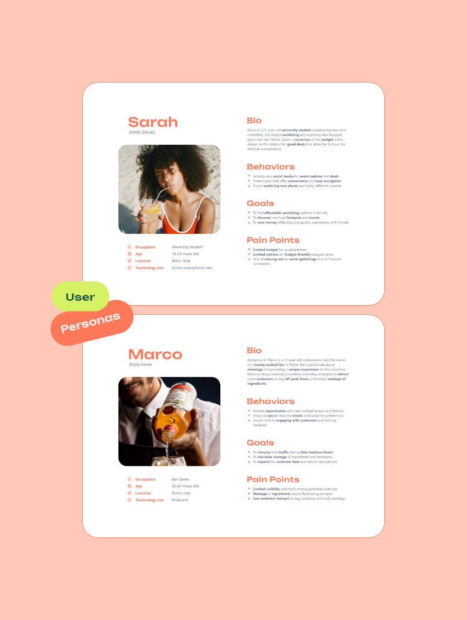
I created two separate personas for store owners and end users, making sure that their unique pain points were addressed.
Our End User is a university student/young adult and a socila drinker with a limited budget.
Our Store Owner is a millenial, proficient in technology seeking to improve customer turnout and visibility.
By collecting feedback and complaints from Store Owners, I was able to identify areas for improvement and new features to implement.
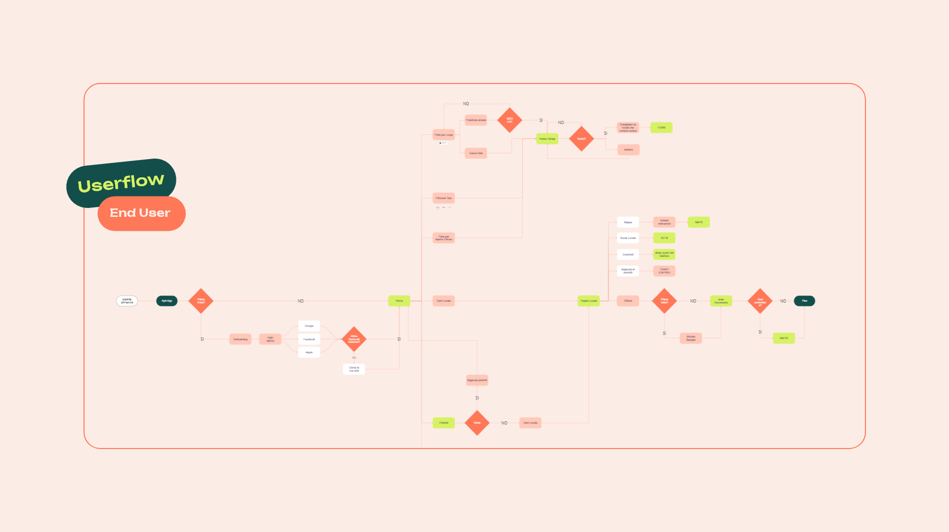
I created user stories covering all aspects of the app. Based on the stories I then created user flows that mapped out the entire user journey.
This process, although time consuming, was necessary to bring more clarity and gather stakeholder feedback before diving into wireframing.
Given budget and time constraints, secondary research was my best bet. I was able to collect valuable insights that improved my decision making.
Ideally i would’ve used User Interviews and A/B testing. But hey, secondary research is better than no research at all.
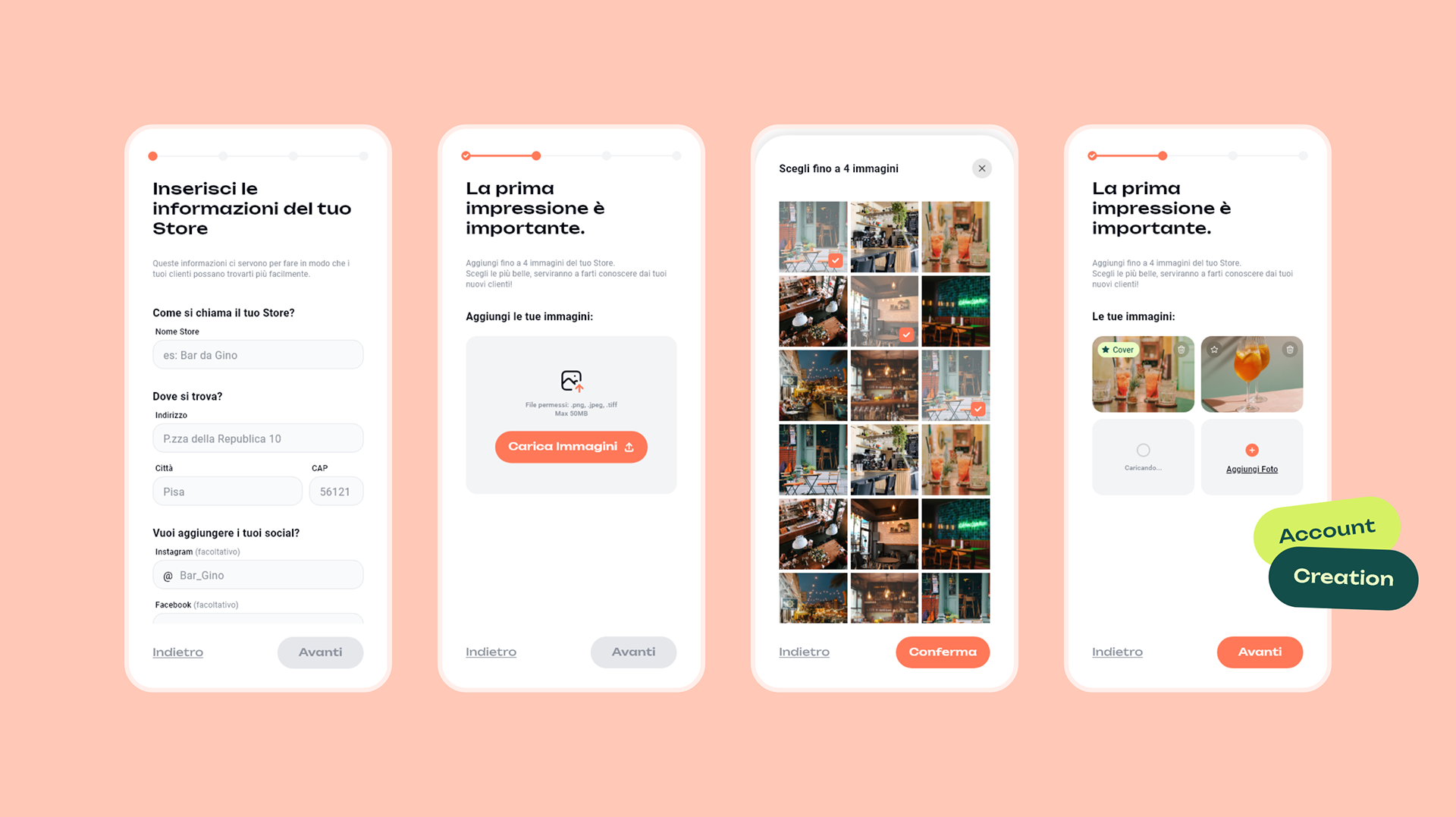
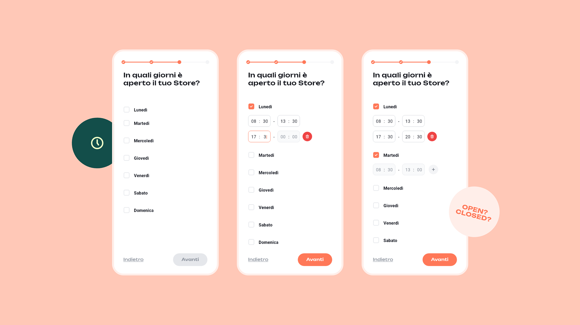
Minimizing drop-off rates and data-overload during OnBoarding.
The onboarding process for store owners involves a significant amount of data and needed many many MANY inputs – a task that can feel quite overwelming.
My biggest concerns with this flow were preventing data-overload and minimizing drop-off rates.
So, here’s how I tackled it:
I broke down the onboarding process into bite-sized tasks using a progressive disclosure approach coupled with a stepper. This helps make the task more manageable and less daunting.
On top of that I leveraged the Zeigarnik Effect to keep the users engaged.
I infused the onboarding process with a colloquial and encouraging tone. On top of that I incorporated little tips and explanations for each requested piece of information.
My goal was to assist and motivate users to complete the process to the best of their abilities.
To further streamline the onboarding experience, I set default options wherever feasible. (ex. Opening and Closing hours)
By doing so, I aimed to reduce cognitive load and decision fatigue for users.
Before finalizing the onboarding process, we lead users through the creation of their first offer. Here’s why:
I aimed to guarantee that every store going live would have at least one active offer visible to our end users.
This enhances the app’s appeal and provides immediate value for End Users: more store with offers to choose from 🙂
I wanted to make sure Store Owners concluded their journey on a high note, leaving them feeling accomplished and confident in utilizing Easy Drink’s key features.
By guiding them through offer creation, we not only demonstrated the app’s value but also empowered them with the knowledge of how Easy Drink could benefit their business.
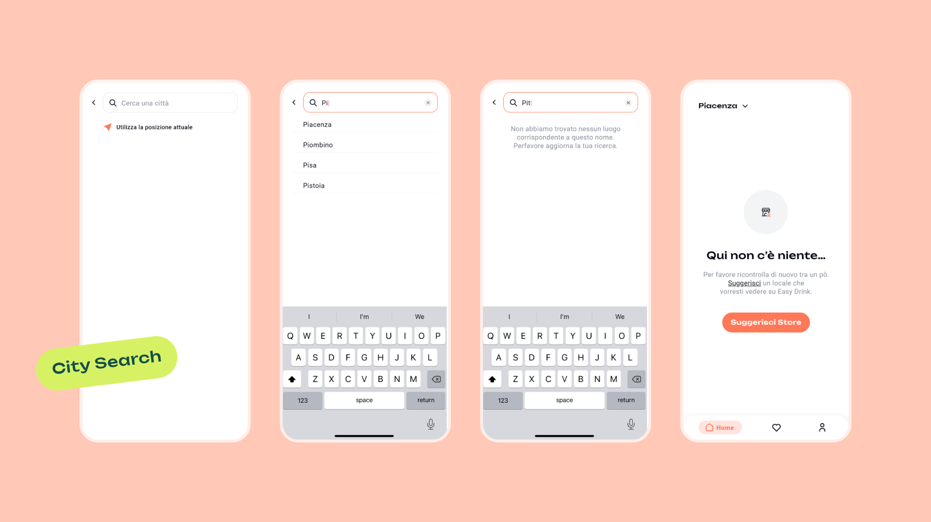
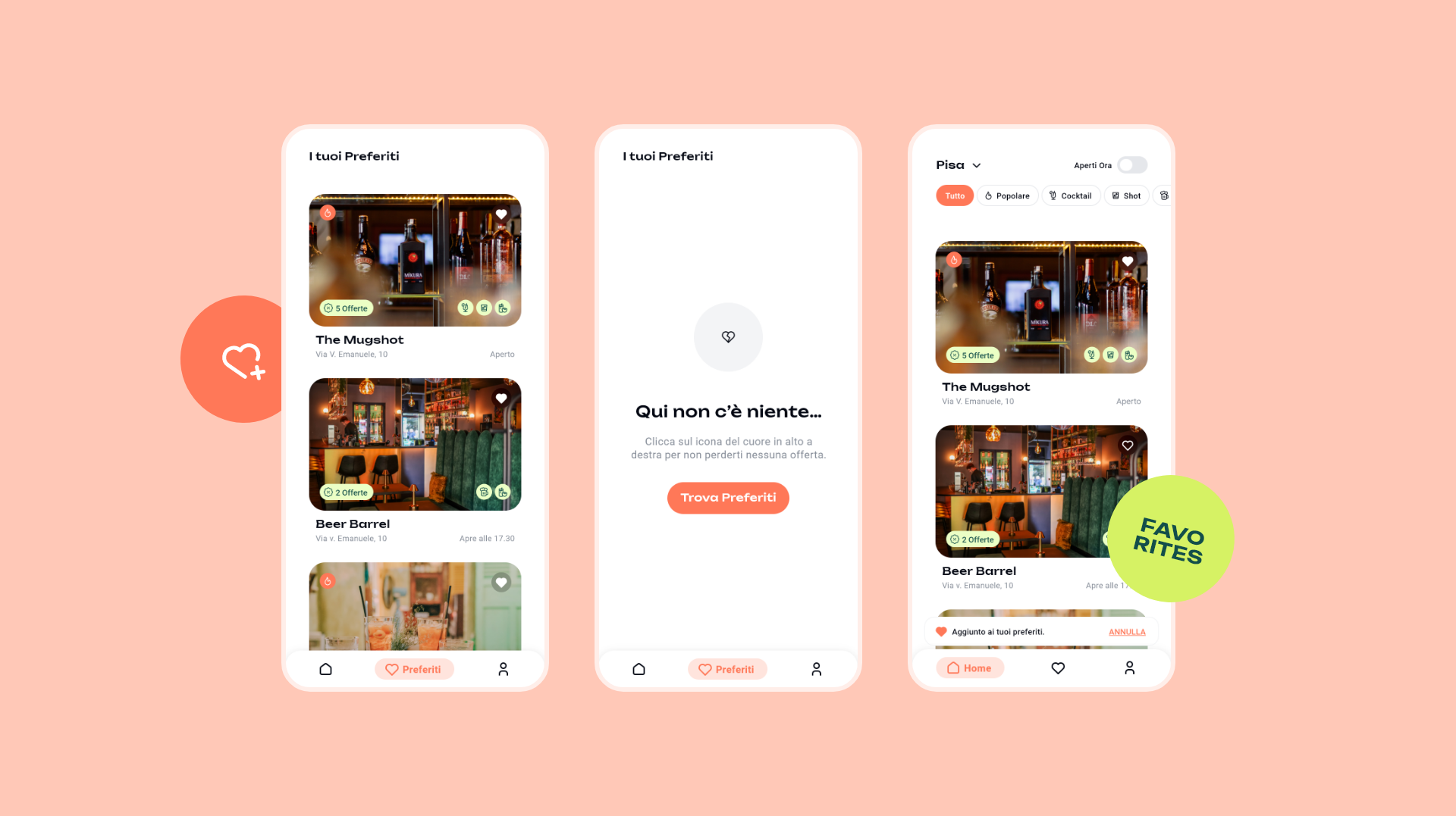
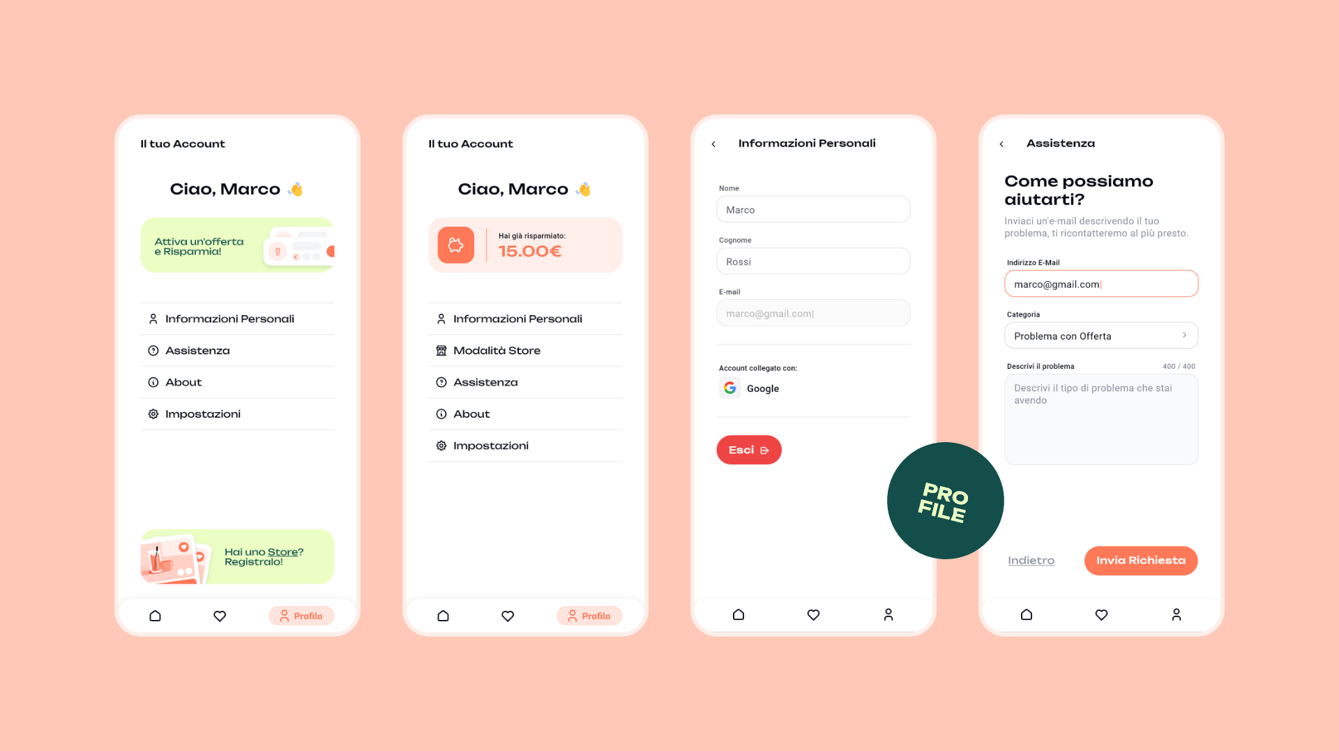
Screens, screens and more screens
The app’s scope was extensive, and while I couldn’t include every screen, here’s a glimpse of a few more to round out the experience!
